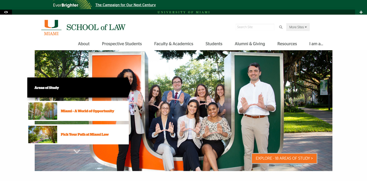
law.miami.edu
Background
The University of Miami School of Law’s website was on a content management system (CMS) nearing end-of-life.
Additionally, the site used an outdated page structure, was difficult to navigate, and had poorly designed high-traffic pages.
My Role
I researched, designed, project managed, and migrated the website into an existing CMS used by the greater university.
I received support with the grunt work of migrating interior pages and setting up the back-end of the site.
The Previous homepage
Desktop
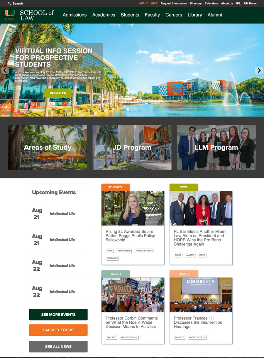
Hero carousel with extremely wide-ranging topics | Limited information about degree programs | News & event items occupied a large section of the homepage
The result
User research was the foundation of the redesign, which helped us:
- Better understand the needs of the website's audience groups
- Identify the most important user tasks
- Evaluate the current website's features against the sites of competing law schools
After analyzing the results of the research phase, the website was divided into 6 audience-based sub-sites, each with its own sub-domain.
The website's audiences had web content tailored to their specific needs, making it easier for users to find information and interact with the law school's various departments.
As a result, bounce rates improved to 43.6%, which compares favorably to the benchmark for higher education, 55.7%, and the previous bounce rate, 52.3%.
The new homepage
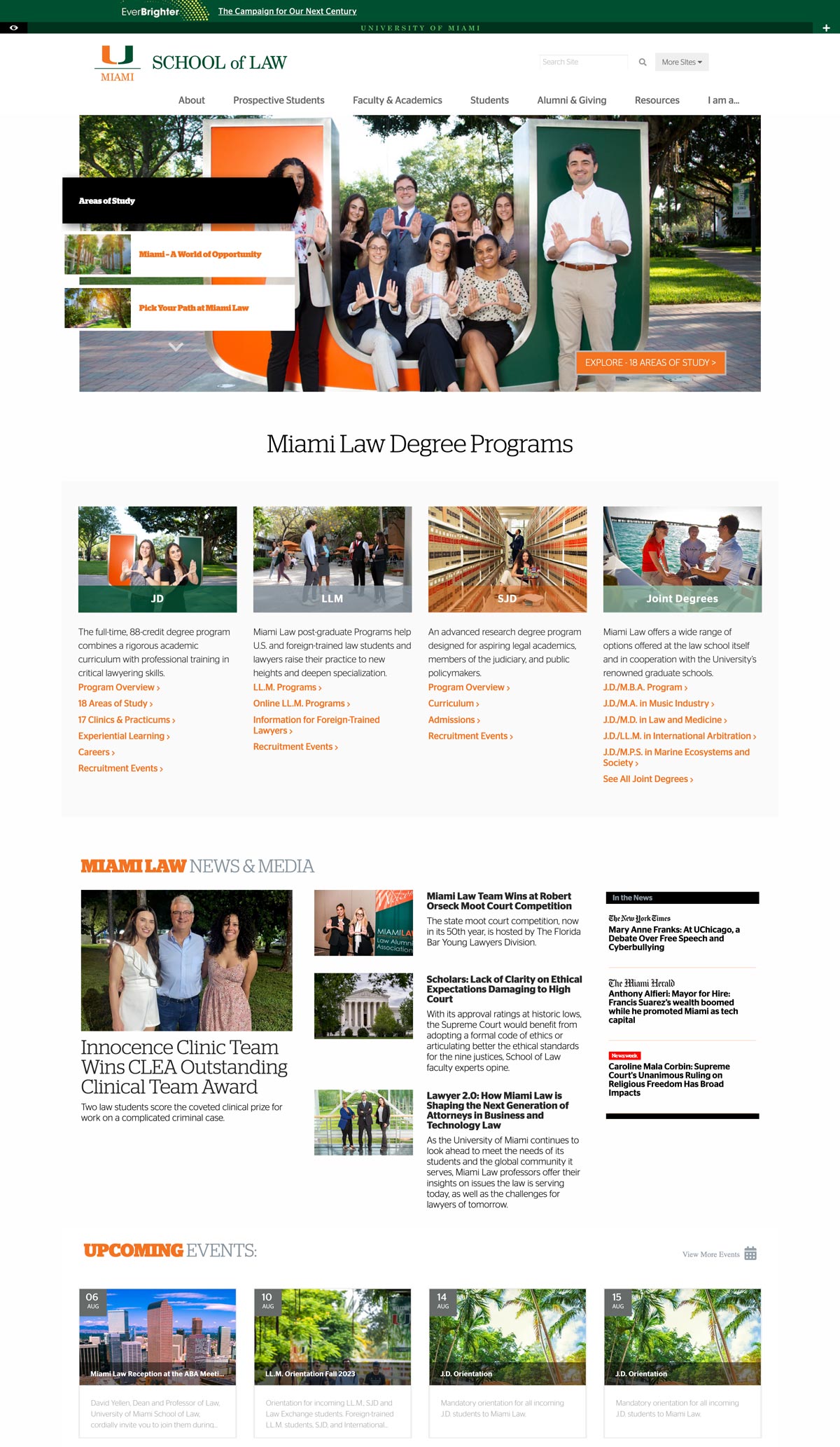
Hero carousel targeted to prospective students | Prominent information about degree programs | News & events less emphasized
Before & AFter - Apply Now
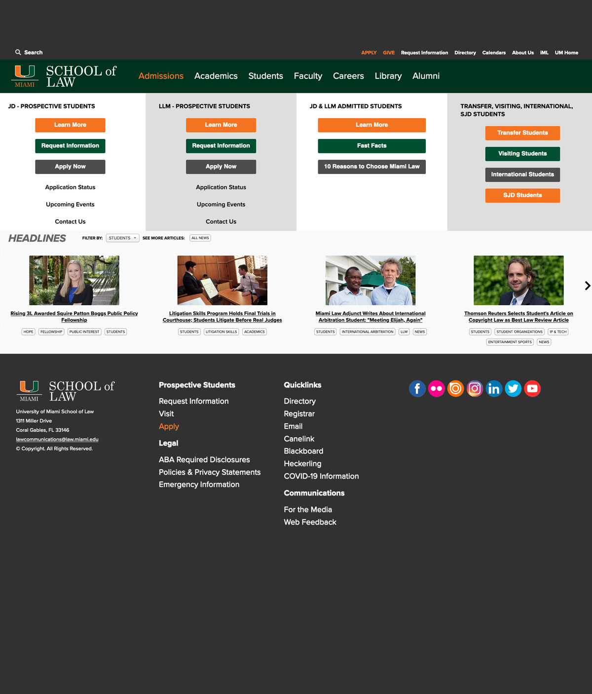
From requesting information, connecting with the admissions department, applying, and ultimately enrolling - deciding where to go to law school is a journey.
The previous website put the burden of navigating the journey on the user.
The redesigned site distinguishes touchpoints more clearly, reducing friction for users to take action and progress through the process.
Before | After

the Journey
USER Research
At the forefront of the project, user research methods were conducted to provide insights about:
- The target audiences of the site & its usability - via a Usability Study
- How the most important audience group mentally categorized the site's content (to inform navigation) - via Card Sorting
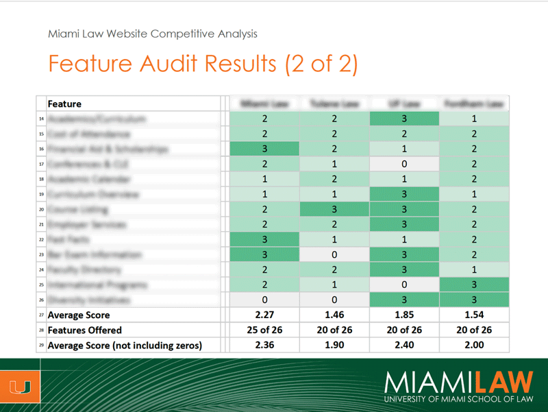
- How the current site performed vs. competitors in regards to ease of use and features offered - via a Competitive Analysis
Research Resuts
(Redacted for privacy)


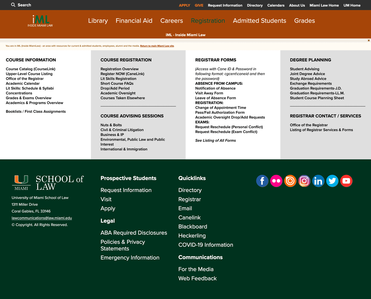
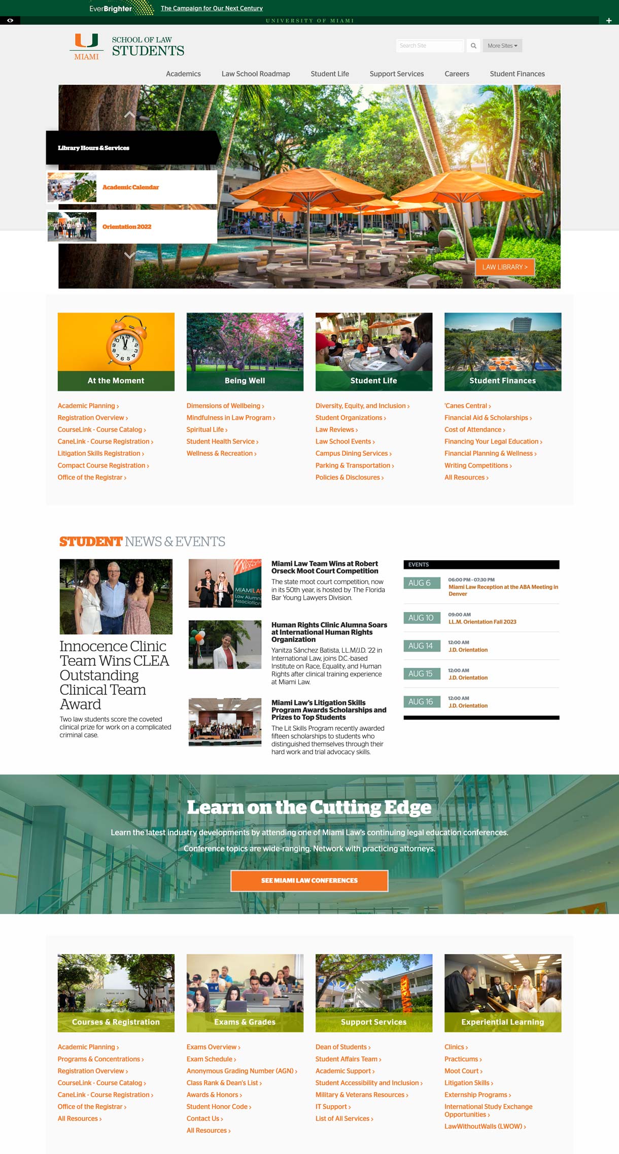
Before & AFter - Landing page for students
Current students benefited from a significantly improved experience after the redesign.
Students need access to administrative content not of interest to the majority of users. Previously, this content was scattered across the main website, and a confusing public-facing intranet.
After the redesign, their content was organized holistically and made easier to find thanks the dedicated navigation on their own sub-site.
Before | After
Design
After the needs of each user group became apparent in the research phase, the web content was divided into six smaller sites with their own sub-domains.
Each audience group would now have a site tailored to their specific needs. While there were usability trade-offs to consider, the benefits outweighed the downside.
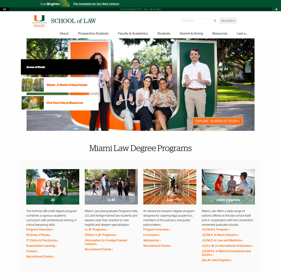
main site
LAW.MIAMI.EDU
The main website contains information about:
- The law school overall and its faculty
- Academic programs, centers & institutes
- Experiential learning
- Careers
- Events & continuing legal education
prospective students
admissions.law.miami.edu
Contains information about:
- Degree programs
- Areas of study
- Scholarships & financial aid
- Admitted student resources & orientation

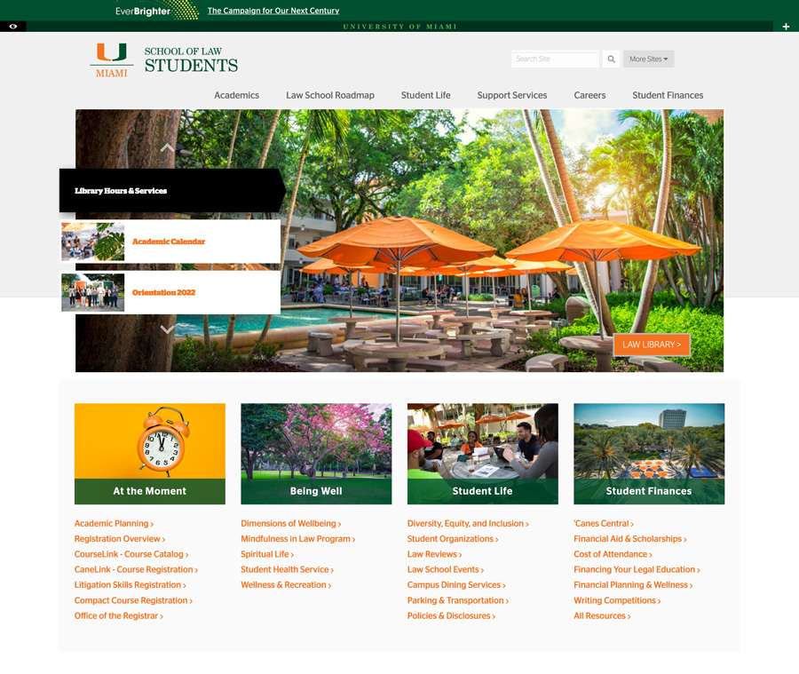
Current students
students.law.miami.edu
Contains information about:
- Course & registration information
- Exams & grades
- Student organizations
- Support and wellness resources
- Graduation & bar exam information
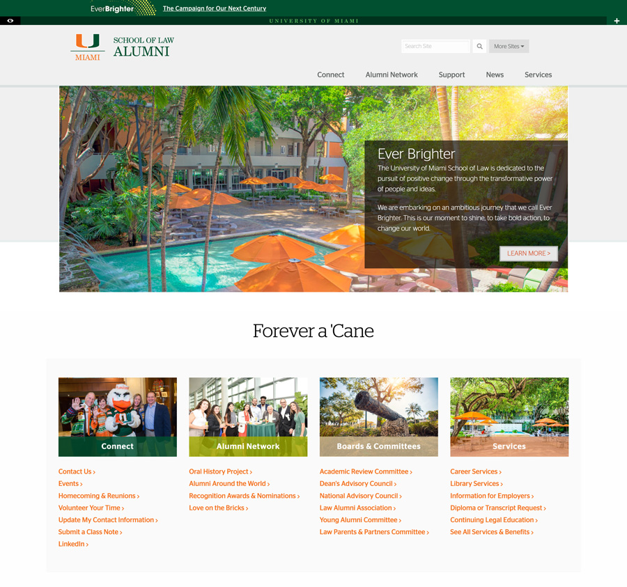
alumni
alumni.law.miami.edu
Contains information about:
- Resources for law alumni
- Ways to support the law school
- Alumni news & events
- Ways to connect with the alumni base
- Alumni boards & committees
Learn More
Reach out to me directly if you would like to learn more about this project.
